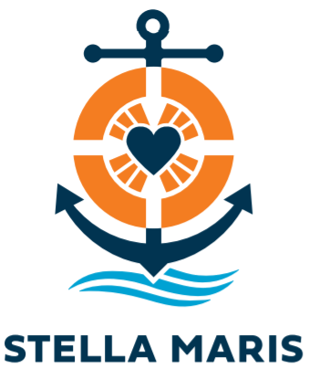
Apostleship of the Sea has long been known as Stella Maris by seafarers and fishers across the globe and so, as part of our Centenary this year, we are refreshing our logo and updating our name to better reflect the way we are known by those we serve.
We have developed our new logo to fit comfortably within the maritime sector. The bold clear symbols make our logo easy to recognise when visibility is compromised by weather or distance.
The elements within the symbol characterise our mission:
- The anchor symbolises Hope: when the anchor is dropped at sea, it holds fast to keep the ship and crew safe – just as we hold fast to our hope in God to keep us safe.
- The lifesaver symbolises Faith: when a seafarer falls into the sea, they put their trust in the lifesaver to save them – just as we put our faith in God for eternal salvation.
- The heart symbolises Charity: the heart of Christ is full of love for all – our charitable works are animated by the love of Christ.
- The rays of light symbolise the Light of Christ: the light emanates from the Heart of Christ (the heart), shines towards our Faith (the lifesaver) and is rooted in Hope (the anchor).
- And finally, the waves of the sea mark the environment for our mission – a source of livelihood for seafarers, but also a reminder of danger and death. Accepting and believing in Faith, Hope and Charity leads seafarers and their families to the safe harbour of Heaven.

